If you want to search Cost Curve back issues or link to anything you read here, the web links and archive are online at costcurve.beehiiv.com. You can subscribe there, too.
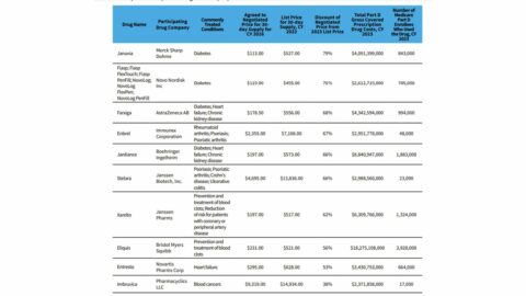
This Reuters analysis, showing how the first 10 “maximum fair prices” under Medicare price controls stack up against prices in four other nations (Japan, Canada, Australia, and Sweden), is worth the read. The topline is that, on average, the MFPs were about twice what the prices were in other countries.
We’re going to be hearing a lot about U.S. vs. OUS prices this month — expect that to be the center of the Novo Nordisk Senate hearing — so soaking in that sort of thinking will help you prepare.
I’m not sure what else there is to say, beyond these three brief points:
I don’t think this is much of a surprise, TBH. I’m not aware of anyone who was expecting the process to end up with Japan-level pricing.
This is a reminder that there are policies worse for pharma than the IRA. International reference pricing — which appears to be the approach favored by Donald Trump — would lead to much more dramatic price changes.
The U.S. system is not designed to select for the lowest possible price. It’s designed to select for innovation and access. It would be interesting if Reuters tried to re-run this analysis with, say, 10 random medicines approved in 2023. Because, chances are, most of the treatments wouldn’t be available in most OUS markets at all. That’s the tradeoff.
Speaking of “I’m not sure what else there is to say,” check out this graph. It’s from the Bureau of Economic Analysis and published in Health Affairs.
To the extent there is a narrative about drug pricing over the past decade, this visualizes it.
The story is essentially that drug costs are dropping, but the average American doesn’t know it/believe it because the burden on the individual continues to mount, largely because of increased deductibles.
(I’m ignoring the gap between the top line in the graph — list prices — and the bottom line, though that elegantly tells another tale, that of the growing gross-to-net bubble.)
This is a fantastic effort to unpack the “$6 billion in savings” claim around IRA price controls. Inma Hernandez, Sean Sullivan, and colleagues — writing in Health Affairs Forefront — do a great job of quantifying where those savings came from … and then provide an extended discussion of why that $6 billion number is not particularly useful.
The new Health Affairs issue just dropped, so there’s a lot of stuff to paw through. It’s worth reading this Tufts’ analysis of how biosimilar markets develop, which suggests that that market is pretty much working properly.
Yesterday, I listed the milestones I was looking ahead to over the remainder of 2024, and readers had a couple of smart additions. There was a suggestion to watch California PBM reform, which (very quietly) passed the legislature and now awaits action from the governor. It’s not as tough as it could be — there’s no spread pricing ban — but it’s nonetheless a sign of the sentiment around PBMs. Also worth watching: how the Biden administration is going to deal with copay accumulators.
This profile of upstart PBM Rightway is notable for a couple of reasons. First, profiles of scrappy PBMs are always notable because they tell us something about which companies are exploring different PBM options (and why). But — second — the piece makes clear what the “Big Three” PBM messaging is on these kinds of stories: they point to numbers showing nearly all of their clients end up re-upping each year, suggesting that there isn’t a huge demand for wildly different options.
I think I’m required to put in an obesity-related link every day, so here is the New York Times looking at the irony of North Carolina’s treatment of the meds. The state will cover GLP-1s for obesity in the state Medicaid program, but not the health plan covering state employees.
The conversation about the IRA’s impact on innovation isn’t over, which is why I’m grateful to BIO for pushing out this helpful explainer on the underlying economics. In short, price controls reduce revenue, and reduced revenue leads to less R&D. You can argue about the degree of those two factors, but it’s hard to argue with the foundation.
Thanks for reading this far. I’m always flattered when folks share all or part of Cost Curve. All I ask is for a mention or tag. Bonus points if you can direct someone to the subscription page.